

Showing posts with label postcards. Show all posts
Showing posts with label postcards. Show all posts
6.20.2011

1.13.2009
Dang Planet Fitness Postcard!
At first glance, this is the same postcard that always comes in my mailbox from Planet Fitness every now and then. Except, wait ...

That's one catchy headline!
But then the copy on this thing is anything but soft.
The message on the addressing side includes a line that says, "We are not here to kiss your butt, only to kick it if that's what you need."
Ok.
11.22.2008
The new "small" postcard?

"Front" (display side)

"Back" (addressing side)
Dimensions: 5 7/16"w x 4 3/16" h - a little smaller than usual. As effective? Have you seen any of these in your mailbox? Let me know. Drop me a comment!
11.05.2008
PostcardMania Shares Tips

PostcardMania's Founder and CEO Joy Gendusa calls the postcard a "humble device" that "may be your best choice for reaching customers this year."
According to Joy, "When the economy is a bit shaky, you should increase promotion to keep your name in the minds of customers, but you also have to keep down your costs. To get maximum return for your marketing dollar, you can mail postcards up to 4 1/4 by 6 inches for between 17.5¢ and 19.5¢ each first class (the cheapest letter rate is 19¢ - 24¢). If you find the right company, you'll likely be able to have 5,000 postcards printed for less than $400."
Joy recommends UV coating (laminated), full-color and 4 1/4-by-6 in. postcards. "This ensures you get the highest-quality look and the biggest post card you can for the lowest mailing rate. The UV coating is essential for a very high gloss finish to make your product look good."
Want more postcard tips? Visit PostcardMania's site where they have a full list of educational articles filled with tips on marketing with postcards. And be sure to visit Joy's blog, "Ask Joy" - to learn even more.
A good company to know about: PostcardMania is a full service postcard direct mail marketing company which includes graphic design, printing, mailing list acquisition and mailing services with free marketing advice. PostcardMania employs over 150 people, has seen positive expansion every year since its inception with its 2007 revenue at nearly $19 million. They have won many awards for their creativity and marketing farsightedness, such as the MarCom International Awards, the Stevie Awards, the Inc 500 List, the Creativity Annual Awards and the Webmaster awards — all of which the underlying theme contributing to their accomplishments is helping companies all over the nation expand. They print 4 million and mail 2 million postcards representing over 33,000 clients in more than 350 industries each week. Visit www.postcardmania.com today.
10.08.2008
A Designer's Perspective: With Guest, Joanne Lewis of Tango Vision, Inc.

Today's guest on The Copy Grove Blog is Joanne Lewis - Art Director of Tango Vision, Inc. Joanne has designed many direct marketing materials with The Copy Grove for a variety of clients, from auto clubs to health insurance companies.
Copy Grove: Joanne, welcome! You have a lot of experience in direct marketing and a keen eye! What graphic trends are you noticing in direct mail these days?
Joanne Lewis: I am noticing a lot of oversized and interesting postcards. With so many credit card offers coming in, these postcards really stand out and attract the eye. I am also seeing some oversized self-mailers that I like as well. Some of my favorites are the Comcast pieces, where I might receive an oversized postcard and then a self mailer a few weeks afterward. With so much traffic in the mail stream, I believe that postcards are a great way to stand out — they are like billboards in the traffic jam.
Copy Grove: Of all the direct mail packages you designed, which one was the most challenging and why?
Joanne Lewis: I had a client in Michigan who was an insurance third party administrator. Our audience was Mortgage professionals and the product was a blanket home equity protection product. The writer I was working with, Jennifer Thomas Vanadia, and I came up with a concept of mailing out "coasters" that had pictures and the stories of various "insurance risks" ... people who took their loans and did things like blew the money on exotic vacations, went fishing, or even donated their homes to care for wayward felines. The challenge of the package was to provide something that these brokers might keep on their desks or hang on their office bulletin boards. Our budget didn't cover traditional coasters so we decided to use heavy cardboard and varnish. We also used a see through vellum envelope with a letter with a teaser that read, "Just think about them once a year. We'll take care of the rest." The six "coasters" were inserted inside the letter and the outside envelope was fairly thick. The challenges were mainly production oriented. I think it's usually easier to come up with the great ideas than it is to make them a reality at times.

(Above: Photo of heroes mailing, courtesy of Tango Vision, Inc.)
Copy Grove: Joanne, welcome! You have a lot of experience in direct marketing and a keen eye! What graphic trends are you noticing in direct mail these days?
Joanne Lewis: I am noticing a lot of oversized and interesting postcards. With so many credit card offers coming in, these postcards really stand out and attract the eye. I am also seeing some oversized self-mailers that I like as well. Some of my favorites are the Comcast pieces, where I might receive an oversized postcard and then a self mailer a few weeks afterward. With so much traffic in the mail stream, I believe that postcards are a great way to stand out — they are like billboards in the traffic jam.
Copy Grove: Of all the direct mail packages you designed, which one was the most challenging and why?
Joanne Lewis: I had a client in Michigan who was an insurance third party administrator. Our audience was Mortgage professionals and the product was a blanket home equity protection product. The writer I was working with, Jennifer Thomas Vanadia, and I came up with a concept of mailing out "coasters" that had pictures and the stories of various "insurance risks" ... people who took their loans and did things like blew the money on exotic vacations, went fishing, or even donated their homes to care for wayward felines. The challenge of the package was to provide something that these brokers might keep on their desks or hang on their office bulletin boards. Our budget didn't cover traditional coasters so we decided to use heavy cardboard and varnish. We also used a see through vellum envelope with a letter with a teaser that read, "Just think about them once a year. We'll take care of the rest." The six "coasters" were inserted inside the letter and the outside envelope was fairly thick. The challenges were mainly production oriented. I think it's usually easier to come up with the great ideas than it is to make them a reality at times.

(Above: Photo of coaster mailing, courtesy of Tango Vision, Inc.)
Copy Grove: From a design perspective, what can a marketer do to make his or her direct mail package stand out among the clutter and get opened?
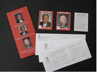
Joanne Lewis: Again, I like postcards right now for really standing out in the mail. I also like adding something special to a package. A client of mine in Washington D.C., St. Johns College High School, was looking for something different for their annual appeal a couple of years ago. I recommended that they recognize some of their "heroes" (teachers, coaches, administrators) with a series of trading cards. The cards were sent out with a letter, reply, BRE and each card had the name and photo of the "hero" on the front with their "stats" on the back. The teaser copy on the outside envelope alluded to the cards and the cards became so popular with the alumni and staff that the second set of "heroes" were sent out the next year. As far as standing out, color goes a long way, a compelling teaser will get me inside a package, using a non-standard size is good. I am seeing a lot of white outside envelopes and some good use of color will always catch my eye.
Copy Grove: From a design perspective, what can a marketer do to make his or her direct mail package stand out among the clutter and get opened?
Joanne Lewis: Again, I like postcards right now for really standing out in the mail. I also like adding something special to a package. A client of mine in Washington D.C., St. Johns College High School, was looking for something different for their annual appeal a couple of years ago. I recommended that they recognize some of their "heroes" (teachers, coaches, administrators) with a series of trading cards. The cards were sent out with a letter, reply, BRE and each card had the name and photo of the "hero" on the front with their "stats" on the back. The teaser copy on the outside envelope alluded to the cards and the cards became so popular with the alumni and staff that the second set of "heroes" were sent out the next year. As far as standing out, color goes a long way, a compelling teaser will get me inside a package, using a non-standard size is good. I am seeing a lot of white outside envelopes and some good use of color will always catch my eye.

(Above: Photo of heroes mailing, courtesy of Tango Vision, Inc.)
Copy Grove: Thank you, Joanne, for sharing your insights and thoughts with us today. We look forward to hearing more from you and having you back again.
Joanne: You're very welcome! Anytime...
Joanne can be reached at Joanne_Lewis@comcast.net
10.07.2008
Prediction: More postcards

Now that banks are less willing to lend money and corporations are laying off workers, chances are fewer new products and services will be "going to market." As companies become more conservative and less inclined to launch new initiatives, direct marketers will be more focused on retention and cross-sell opportunities. And I predict we will be seeing more postcards in our mailboxes!
After all, when money is tight, it behooves marketers to use the most cost effective ways to "drum up sales" - and the once deemed lowly postcard can now be viewed as an affordable way of getting in the mail and driving sales leads - without the higher paper, lettershop and postage costs of a standard No. 10 package.
If you plan to use a postcard for your direct marketing efforts, here are a few tips:
1) Have a single-minded focus for your marketing message.
Room is tight on a postcard. That means you've got to broadcast your main message and it needs to be an enticing one - either a great savings offer or a much-needed benefit that's going to meet one of your targeted audiences' needs.
2) Put the call to action on the front and the back of the postcard, if you can.
Unless the call to action needs to be personalized and you are not duplex lasering the piece, it's a good idea to put the call to action (the response language - "call now or visit www...") on the front AND the back of the piece. After all, that's the action you want your recipient to take. Make it easy to keep that phone number or web site in clear view and top of mind.
3) Stand out from the clutter but be careful that you don't look so promotional you get lost in the clutter.
Direct mail should always have an air of personal correspondence to it. So don't forgo the "Dear Sample A. Sample" that could go on the personalized side of the postcard in lieu of photos and fancy graphics, or you'll miss a chance to connect and speak directly to your targeted audience members. (I read somewhere that self-mailers got a better response when they had a letter that started with a "Dear ..." and had a signature at the end. A postcard is a kind of self-mailer. So why not give your postcard a personal edge? It can help it stand out in the clutter.) Use the other non-personalized side for your attention grabbing headline and graphics. When a postcard is too "design-y" with "bang-them-over-the-head" visuals on both sides, it tends to feel too much like a general advertising piece that's trying very hard to sell something and less like personal correspondence with something very important to tell me, about something that's especially for me - to meet my needs. And I'd much rather receive the latter. Wouldn't you?
Below is a sample postcard that follows many of the tips mentioned here. As you'll see, there is a little letter on this side of the postcard that begins, "Dear Advertiser:"

This is side 1 of a postcard that was mailed as a reminder to advertisers of products and services relative to the Chemical Engineering profession, alerting them of the close date for inserting their ads in AIChE's CEP (Chemical Engineering Progress) magazine. It's always smart to mail to your current client/member or user database to remind them about added ways you can serve their needs. As that old saying goes, your best customers are the ones you already have!
This is the reverse (side 2) of the postcard pictured above:
 Notice it's more colorful and contains more details about the magazine contents, so advertisers can tailor their message to editorial content.
 Postcards such as the one shown here were mailed throughout the year, with the same format, different copy and color schemes to match the season or time of year. This card mailed in the early fall.
Subscribe to:
Posts (Atom)