

Today's guest on The Copy Grove Blog is Joanne Lewis - Art Director of Tango Vision, Inc. Joanne has designed many direct marketing materials with The Copy Grove for a variety of clients, from auto clubs to health insurance companies.
Copy Grove: Joanne, welcome! You have a lot of experience in direct marketing and a keen eye! What graphic trends are you noticing in direct mail these days?
Joanne Lewis: I am noticing a lot of oversized and interesting postcards. With so many credit card offers coming in, these postcards really stand out and attract the eye. I am also seeing some oversized self-mailers that I like as well. Some of my favorites are the Comcast pieces, where I might receive an oversized postcard and then a self mailer a few weeks afterward. With so much traffic in the mail stream, I believe that postcards are a great way to stand out — they are like billboards in the traffic jam.
Copy Grove: Of all the direct mail packages you designed, which one was the most challenging and why?
Joanne Lewis: I had a client in Michigan who was an insurance third party administrator. Our audience was Mortgage professionals and the product was a blanket home equity protection product. The writer I was working with, Jennifer Thomas Vanadia, and I came up with a concept of mailing out "coasters" that had pictures and the stories of various "insurance risks" ... people who took their loans and did things like blew the money on exotic vacations, went fishing, or even donated their homes to care for wayward felines. The challenge of the package was to provide something that these brokers might keep on their desks or hang on their office bulletin boards. Our budget didn't cover traditional coasters so we decided to use heavy cardboard and varnish. We also used a see through vellum envelope with a letter with a teaser that read, "Just think about them once a year. We'll take care of the rest." The six "coasters" were inserted inside the letter and the outside envelope was fairly thick. The challenges were mainly production oriented. I think it's usually easier to come up with the great ideas than it is to make them a reality at times.

(Above: Photo of heroes mailing, courtesy of Tango Vision, Inc.)
Copy Grove: Joanne, welcome! You have a lot of experience in direct marketing and a keen eye! What graphic trends are you noticing in direct mail these days?
Joanne Lewis: I am noticing a lot of oversized and interesting postcards. With so many credit card offers coming in, these postcards really stand out and attract the eye. I am also seeing some oversized self-mailers that I like as well. Some of my favorites are the Comcast pieces, where I might receive an oversized postcard and then a self mailer a few weeks afterward. With so much traffic in the mail stream, I believe that postcards are a great way to stand out — they are like billboards in the traffic jam.
Copy Grove: Of all the direct mail packages you designed, which one was the most challenging and why?
Joanne Lewis: I had a client in Michigan who was an insurance third party administrator. Our audience was Mortgage professionals and the product was a blanket home equity protection product. The writer I was working with, Jennifer Thomas Vanadia, and I came up with a concept of mailing out "coasters" that had pictures and the stories of various "insurance risks" ... people who took their loans and did things like blew the money on exotic vacations, went fishing, or even donated their homes to care for wayward felines. The challenge of the package was to provide something that these brokers might keep on their desks or hang on their office bulletin boards. Our budget didn't cover traditional coasters so we decided to use heavy cardboard and varnish. We also used a see through vellum envelope with a letter with a teaser that read, "Just think about them once a year. We'll take care of the rest." The six "coasters" were inserted inside the letter and the outside envelope was fairly thick. The challenges were mainly production oriented. I think it's usually easier to come up with the great ideas than it is to make them a reality at times.

(Above: Photo of coaster mailing, courtesy of Tango Vision, Inc.)
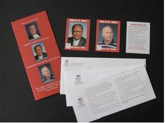
Copy Grove: From a design perspective, what can a marketer do to make his or her direct mail package stand out among the clutter and get opened?
Joanne Lewis: Again, I like postcards right now for really standing out in the mail. I also like adding something special to a package. A client of mine in Washington D.C., St. Johns College High School, was looking for something different for their annual appeal a couple of years ago. I recommended that they recognize some of their "heroes" (teachers, coaches, administrators) with a series of trading cards. The cards were sent out with a letter, reply, BRE and each card had the name and photo of the "hero" on the front with their "stats" on the back. The teaser copy on the outside envelope alluded to the cards and the cards became so popular with the alumni and staff that the second set of "heroes" were sent out the next year. As far as standing out, color goes a long way, a compelling teaser will get me inside a package, using a non-standard size is good. I am seeing a lot of white outside envelopes and some good use of color will always catch my eye.

(Above: Photo of heroes mailing, courtesy of Tango Vision, Inc.)
Copy Grove: Thank you, Joanne, for sharing your insights and thoughts with us today. We look forward to hearing more from you and having you back again.
Joanne: You're very welcome! Anytime...
Joanne can be reached at Joanne_Lewis@comcast.net
No comments:
Post a Comment