6.16.2010

You've Come A Long Way Since Bill Cosby


Temple University's fundraising pitches have come a long way since the tv commercials featuring Bill Cosby (who attended the University) with the memorable refrain, "I could have gone anywhere - I chose Temple." While not as high-profile as the Cosby spots, today's fundraising efforts from the University show spunk and creativity, as is the case with this recent email that I received from my alma mater, with the intriguing subject line:

A chair. A camera. 60 seconds.

To be truthful, when I read that subject line, I thought Temple wanted me to make a video for them (a chance to use the camera on my MacBook Pro and maybe get famous?). Silly me! And when the email opened with this personalized message ...

Cynthia,

During finals week in May, Temple students
were given one last test - to convince you
in just 60 seconds to support the university.

Click here to decide whether they passed.

... of course, I had to click to see the video.


I think you'll agree, this video is a great way to bring real faces to a fundraising effort, and what greater way to talk about supporting the next generation of society-molders than having them speak for themselves and the University.

Go Temple!

To give to the University, click here.

6.04.2010

Long Live Summer ~ and Star Rewards!

For quite a few years, the mailers that Macy's has been sending to their charge card customers featured "clean release" cards (sometimes, they're not so clean and full of goo when you pull the cards off the mailer). The cards were good for "Star Rewards" discounts on purchases made with Macy's charge cards. These mailers tended to have upwards of four (or more) cards affixed. That's gotta be expensive to produce. So I wasn't surprised when this new mailer from Macy's arrived, sans the glued-in cards.

The format is a self-mailer with an insert that pulls out of the mailing sleeve. The insert is cleverly designed to pull down from the bottom, with the line of demarcation acting as the liquid inside of a die-cut cocktail glass, to reveal the word "CHEERS." When the insert is pulled completely out of the sleeve, you are left holding a little red booklet with one page filled with four discount cards, which you then can tear out.

With summer only 17 days away and the coupons good from June 3rd through July 18th, this is one promotion I'll be holding onto ~ and using on my next trip to the mall.

6.01.2010

Where my mother/fathers at?


Watch as the Sienna Family drops their hot new single, Swagger Wagon. This goes out to all you minivan families ...

4.06.2010

Where's The Bun?

When I heard KFC was making a sandwich with no bread, I was thinking it would be like P.F. Chang's lettuce wrapped chicken ... not this monstrosity:Two all chicken patties, special sauce, cheese ... and is that bacon I see too? No bun. KFC’s new Double Down sandwich, which will become available at the chain's fast food locations nationwide and cost a whopping five bucks, is better than a bag of beef jerky, I guess, if you're into protein power. Atkins Diet followers will no doubt love this fare. But those who are watching their waistline, look out. This sandwhich is featured on a web site called "This is why you're fat; where dreams become heart attacks."

How would you advertise this sandwich? Forget the "Where's The Beef?" lady. Here's how KFC is doin' it:

Are you hungry now?

3.15.2010

Do You See The Trend Here?

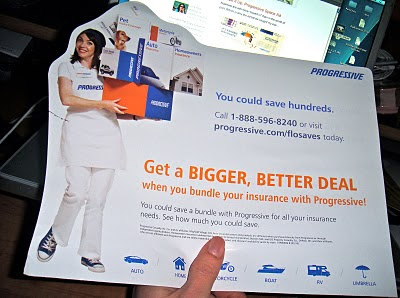
You've seen the newspaper print ad. Here's the free-standing mailbox insert. See the trend here? It's all about shape. Good tie in.

After I wrote my previous post, I thought all of you highly-evolved creative and marketing readers out there were thinking, "Big deal." And maybe I was making a big deal out of a little thing. But it pays to notice subtle creative touches like the trend here. You never know when they'll come in handy.


3.11.2010

Shape It Up: Progressive Space Ad

Nowhere are ads more "boxed in" than in the world of print. Which is why the ad below caught my eye ...


Here, Progressive Auto Insurance works its space at the bottom of the page in USA Today's Life Section, with an ad that follows the shape of an umbrella. If not for a thin black border, the ad would blend in completely with the newspaper's "table of content" area. Taking a quick glance, a reader might think the ad is a teaser for a newspaper article featuring Flo, the gal from the Progressive ads. (I wonder, might this ad have been even more eye-catching with reversed-out type and a dark background?)

Nevertheless, the next time you have a space ad assignment, inquire with the publication about shapes other than squares or rectangles. You might find some creative leeway you can use to make your ad stand out from the clutter.

2.09.2010

What NOT to do in Direct Mail Creative


Double window envelopes - the kind that have a window in the upper left corner for the sender's information to show through, plus a window below it for the recipient's information - are pretty generic. They can be blank (just stock paper with no teaser copy printed on the envelope) and used by any sender and sent to anyone, so long as the sender's logo and recipient's addressing information are positioned to show through the windows properly. So this envelope says to me "generic."

And the teaser copy "This is not junk mail" says doodly-squat. In fact, that's a generic teaser. Could be used by any company. This is not junk mail? Yes, it is.

Worse yet, CLEAR - the company that mailed this gem of a direct mail package - is a wireless internet service that's trying to make a name for itself, and this isn't the way to do it in direct mail. So my message to them is: "My dear CLEAR, you can gain a stronger foothold in the marketplace with a clearer message on your envelopes about what you have to offer, rather than hyping what you're not. I mean, you're not the unVerizon or the unComcast, are you?"

Let this be one small lesson to direct marketers in "What NOT to do in Direct Mail Creative."

Until next time ...

1.22.2010

Do Not Bend

The "Do Not Bend" caption on a direct mail envelope is something we marketers have been using for years. And it's good to see it's still in use - a tried and true line of copy that's more curiosity provoking than warning.

Recently, these two samples arrived in my mail - each bearing the same "Do Not Bend" teaser copy. Reading the cautionary words, the recipient is made to believe that there's something delicate inside that could be harmed by bending - a photograph perhaps? We often use this line of copy when there's a membership or plastic card inside the package - to allude to the thing of value without showing it and heighten the curiosity factor. What's inside the envelope? In these two cases, nothing so worthy of the "Do Not Bend" line, such as a membership card or photograph. Just magazine subscription renewal forms - BUT the cautionary line of copy DID get me to open the envelope, and that's half the battle in direct mail.

Now, if they'd only make me reply!

12.01.2009

Catalog Wednesday


We've got Black Friday for brick and mortar shopping and Cyber Monday for online shopping. How about Catalog Wednesday for catalog shopping?

And to help us get started, CVS is on the scene with this new catalog ...


Yes, pharmacy super store CVS has put out a glossy, 4-color, 84-page Holiday shopping catalog for the first time. The piece arrived in my mail about two weeks ago. If you didn't get yours, they're giving it out at the retail stores. Items are available in the stores, online AND by calling 1-800-shopCVS. Take that, Walgreens!

11.18.2009

State Farm Agents Mail Holiday Address Labels


What's New In Agent Insurance Mailings?
Recently, my auto insurance agent retired and a new guy took over his office - and his clientele. Just about a week ago, around the middle of November, the new agent sent me an interesting mailing for the holidays. It was a 6 x 9 envelope with address labels inside. Wow, a lot more costly than your typical/standard holiday greeting card! I'm impressed. While I've seen LOTS and LOTS of direct mail kits with holiday address labels - from just about every charity know to man and woman - I've yet to receive one from my insurance agent. Good show, State Farm and your agents!

10.14.2009

Blog Action Day: Direct Marketing, Paper and Global Warming

Here at The Copy Grove, we recycle paper.

When we get an electronic file, first we ask, "Does this have to be printed out?" In many cases, the answer is "No!" So we try to print out as few documents as possible, to conserve electricity, paper, and ink - not so much for cost-savings but for the sake of being environmentally friendly. Used ink cartridges go to recycling programs whenever possible. And if we print out a document, after the document is read and used, it goes in a pile - and after a couple of months, the pile grows and is repurposed; that is, the paper is sent back to the printer for printing on the other side.

Here's our current pile, soon ready for reuse:


When creating advertising for businesses that use direct mail, we always try to use less paper. Making a mailing more compact and cost-effective by using less paper puts less stress on the environment. And helps keep costs down for our clients. This can be a creative challenge. The writer and designer have to make the most of the paper that they DO have to use. For writers, that means more powerful, shorter headlines and more concise yet persuasive body copy. For designers, that means more powerful graphics that grab attention and generating a layout that leads the eye through the message. Bottom line here is you need a strong creative idea - one that is so strong, you don't need a big, long spiel to get the desired action from your reader.

Of course, you can print your entire mailing on recycled paper. To learn more, read this excellent brochure by the Recycled Paper Coalition.

And for a discussion on direct mail versus e-mail, see this article by Barry Abel, where he tells us ...

"The 20 percent increase in the cost of paper over the past two to three years is being caused in part by higher labor costs as well as higher fuel costs to get wood to the mill, run the papermaking machines and transport the finished product to warehouses and on to printers.

Moreover, many paper mills are making investments to become more eco-friendly, incurring costs to train employees in new processes and procedures. Printing and postage costs are also rising, and additional paper price increases are likely."


Do you have thoughts, suggestions, ideas to share on this topic? Please join in the conversation, in honor of Blog Action Day 2009: Climate Change, and leave a comment with what you have to say or a link to your blog or web site.

"Blog Action Day is an annual event that unites the world's bloggers in posting about the same issue on the same day on their own blogs with the aim of sparking discussion around an issue of global importance. Blog Action Day 2009 will be the largest-ever social change event on the web. One day. One issue. Thousands of voices."

9.16.2009

Who's Spending The Marketing Dollars These Days?

Looks like fundraisers aren't slimming down their packages lately - they're beefing them up. Sandy Rees, CFRE at her Get Fully Funded blog asks, "Do you know when the best times are to mail a fundraising appeal?" She gives the answer, "Studies show that there are definitely months of the year that produce better results than others. October is the best month to mail." Ok, so that may explain why fundraising efforts that arrive in my mailbox lately are chock-full of incentives for me to give. Case in point, these two recent efforts from Paralyzed Veterans of America.

In a test situation where the fundraiser mails one group of people one kit and another group of people another kit to see which package gets the most response, I should have only received one of these packages. Nevertheless, I am now the lucky recipient of a Holiday Favorites music CD which arrived in the "Christmas in September" package, as well as a free notepad with a patriotic (Labor Day tie-in) motif AND address labels to match the notepad. Chances are, these two kits are NOT testing against one another. There was probably an oversight in the scheduling and list selection that enabled me to get both kits on the same day last week. But since I did get both and I know the mailer has put a lot of money into these free gifts, I am inclined to donate to this charity, as I have done in the past.

However, a situation like this where two kits arrive at the same address on the same day could turn out to be a big waste of the charity's money if the recipient doesn't make a donation in response to either package. Also, even if the recipient gives a gift, if it's not "enough," then it won't offset the cost of mailing two kits to the same address on the same day. In a perfect world, the Christmas kit should have been sent to me in October, as a kind of follow-up, 2nd effort to the notepad/label kit - IF I didn't reply to the first effort.

Such is life. Who knows? There may have been some delays or problems at the inserting or printing stage.

What we can see is that fundraisers aren't being shy about spending money on their direct mail appeals. In this economy, that's a good thing for direct marketer vendors serving these charities. Instead of mailing 2-color packages with standard No. 10 envelopes, a letter, reply card and BRE (bare bones), fundraisers are inserting calendars, using custom 4-color envelopes, mailing CDs and more. Hopefully, people who receive these costly packages will also open their wallets and give.

8.25.2009

Special Olympics Fundraiser Mailing


On August 12, 2009, Eunice Kennedy Shriver - the woman known as the founder of the Special Olympics, sister of former president John F. Kennedy, and mother of Maria Shriver - died at the age of 88. The news was abuzz with Shriver's passing ... as it is today with the more recent passing of Senator Ted Kennedy. Shriver advocated tirelessly for the mentally disabled, and two days ago, I received a mailing from the Special Olympics, the organization which has been in the media's light of late due the sad loss of its founder.

The mailing is timed well, because people are more prone to give to this worthy cause due to recent media attention on the passing of its founder. The mailing is also well done, with the centerpiece being a 16-month 2010 calendar (the first month is September 2009), featuring paintings by Jennifer Nolin Winkler, an extremely talented 24-year-old Special Olympic athlete for 11 years.

The calendar is sized to fit in an envelope that is small enough not to incur the extra postage of a flat mailing. And on the back of the calendar is a quote from Eunice Kennedy Shriver...

"Every person, regardless of whatever different abilities they have, can contribute, can be a source of joy, can beam with pride and love."

You can't help but love the tagline for the Special Olympics: "Be a fan(R)" And, I might add, a supporter.

While calendars for fundraising and promotional items are a dime a dozen, this mailing stands out for it's great timing and for being so full of heart, thanks the lovely artwork by Jennifer Nolin Winkler.

Thanks for stopping by